Tuesday, May 8, 2018

Lab 11: Flying Drones

For our final lab, each student was able to fly a drone around the South Side Community Garden in Eau Claire, Wisconsin. 


Lindsey Kurtz Completing Drone Configuration


Professor Hupy Setting the Drone to Take Flight


Watching the Drone Follow the Designated Path

Drone in Flight


Monday, April 30, 2018

Lab 10: Distance Azimuth Survey

Introduction: 

GPS technology can be a great tool when completing field work. However, technology isn't always the most reliable and can fail at the worst of times. Learning how to conduct fieldwork using a non-technology based method could be very beneficial in the time of need. The objective of this lab was to conduct a distance azimuth survey. Tree data was collected along Putnam Drive at the University of Wisconsin-Eau Claire. The data was then organized and entered into an Excel spreadsheet to be imported in ArcMap and used to create useful maps.

Methods: 

Ten samples were collected at the first stop on Putnam Drive and then another six samples were collected about 15 meters away. A designated spot was used for a student to stand to take measurements for all of the samples to ensure accuracy for the latitude and longitude coordinates. There was a designated spot for the first ten samples and then a separate spot for the second six samples.  For each tree, the following attributes were collected: lat/long coordinates, distance, circumference, azimuth and tree type. To record the data, a series of instruments were used that don't all rely on technology: BadElf GPS, tape measure (Figure 1), compass (Figure 2), and a laser.

Figure 1: Compass to Measure Azimuth                                      Figure 2: Tape Measure Recording Circumference
The BadElf GPS was connected to an iPhone via bluetooth to collect the lat/long coordinates. The circumference of the trees were recorded in centimeters using a tape measure. The compass was used to record azimuth. This is where the designated spot was utilized. One student stood in the same spot on one side of Putnam Drive during the data collection of the first ten trees to ensure the azimuth was correct and that another student could then repeat the same steps and find the right trees that were analyzed in this lab. The direction shows on face of the compass but it is more accurate to look through the eye hole on the side. For measuring distance, the student standing at the designated spot held a laser that determined the distance to a sample tree in meters. All of the data was recorded in a field notebook during the process and was then later transferred into an Excel document (Figure 3). 


Figure 3: Data Organized in Excel
Then, the Excel table was imported into ArcMap and the Bearing Distance to Line tool was utilized (Figure 4). This tool creates a new feature class representing a line from the attributes. The azimuth data goes into the Bearing Field for this tool. The Feature Vertices to Points tool was also used on this data. This tool creates a point feature class containing all of the attribute data that was collected for each of the trees.

Figure 4: Bearing Distance to Line Tool
Results: 

Using graduated symbols, a map was created to show the difference of circumference between all of the trees (Figure 5).  The smallest recorded circumference from this data set was 12 centimeters to the largest at 116 centimeters, so there was quite the range. Looking at the map, one of the vertexes appears to not be located on the edge of Putnam Drive like the other; this was an error in our data. It was hard to find the problem that caused this slight shift but overall the rest of our data was relatively accurate. 

Figure 5: Tree Circumference
 Figure 6 shows the difference of azimuth in each tree with graduated colors. Most of the trees were recoded within 2 - 80 degrees.
Figure 6: Azimuth of Trees
Conclusion: 

Although technology is a fast and handy tool, it may not always be the most reliable. In this lab, a distance azimuth survey was completed using mostly non technological field tools. It is important to be able to know how to conduct research this way in the scenario that technology fails. Luckily, there are high-tech tools that can be used when completing surveys that have a much larger area to survey. GPS tools today have very high capabilities in recording extremely accurate locations amongst other abilities. 


Monday, April 23, 2018

Lab 9: Arc Collector Part 2: Research Project

Introduction:


In Lab 8, the class split up into groups and collected microclimate data in one of the seven designated zones on the University of Wisconsin-Eau Claire campus and then compiled all the data together. The data that was collected in ArcCollector on the smart phones was then accessed on ArcGIS Online and exported to be opened in ArcMap. Different maps were created to show each of the attributes of data collected. More information regarding the previous lab can be found here. The objective of this lab was to create individual projects that answered a spatial question. The requirements were to think of a point feature to gather and then decide what attributes would be associated with that particular point.

The Eau Claire Planet Walk is a one-mile scale model of the solar system that has a beautiful view of the Chippewa River along the route. Throughout the mile walk, there are a small monuments representing the planets along the route that are located along the scaled model of where they would be in relation to distance in the solar system. Each monument (Figure 1) includes a very detailed description and other fun facts about that specific planet as well who the monument was donated by. There is also a small map on each monument to show where how far long the route that planet is.The spatial question for this lab was determining whether the scale model of the solar system is an accurate representation of the real life distances of the planets to the sun. Attributes that were collected for this lab were planet name, distance from the sun in astronomical units, radius of each planet, condition of the monuments, and a notes section that included information regarding who the monument was donated by. To complete the lab, the long process of creating a geodatabase needed to be attained. This was a very important step in the process in collecting accurate data. ArcCollector was used to retrieve the data so then it could be analyzed on ArcGIS online. 

Figure 1: Saturn Monument
Study Area: 

The study area for the research project spanned from Phoenix Park to the end of Randall Park (Figure 2). The route is paved and ends up leading to a bridge that crosses the river. The Sun is in Phoenix Park and Pluto is in Randall Park. The walk is welcome to start at either park depending on which end of the solar system the walker would like to start at.
Study Area: Eau Claire Planet Walk

Methods: 

After deciding what the spatial question and attributes would be, it was time to create fields and domains to be used in ArcMap. A detailed step by step process on ArcGIS Online demonstrates how to create this. Going to properties in the database, the domains and their descriptions could be added (Figure 3). The domains could be set to different types. For example, the Condition domain was set to coded values: perfect, good, fair, inadequate. The field type was also changed to either text, long integer or float. During the process, a decision was made to record the distance from the planets to the sun by astronomical units because that is the commonly used measurement for solar distance. Each domain helped to represented each monument while aiding with the spatial question.
Figure 3: Creating the domains 
After the domains were created, the data needed to be shared to ArcGIS online to be used for the online map. Once signed in to ArcGIS in ArcMap, the option to connect to My Hosted Service allowed the data to be shared (Figure 4). Another important step was to the check the boxes of Create, Update, Delete, and Sync in the Feature Access tab to allow changes to be made while collecting the data. Once all of the necessary steps were completed, the data could be published to ArcGIS Online to then be used in ArcCollector.

Figure 4: Publishing process to ArcGIS Online
Using ArcCollector on a smart phone, the data points were recorded at each planet monument along the Eau Claire Planet Walk route (Figure 5). Data was recorded within the appropriate domains. 

Figure 5: Recording data in ArcCollector

Results: 

Once all the data points were collected, they were analyzed in a map in ArcGIS Online. The link to this online map can be found here. There is an option to select the individual points to where a pop-up window appears displaying the attribute information about each of the monuments (Figure 6). The figure below shows the Neptune monument with all the information of each attribute except for the Notes section. This was a user error that occurred within the process. Who the monument was donated by was recorded in the notes section for each planet in ArcCollector but it did not save or show up in ArcGIS Online. It was discovered that the field type was set to Float instead of Text while creating the domains back in the beginning. This error just proves that the initial domain creation is very important when collecting data because one wrong step could end up disrupting the results.

Figure 6: Pop-up window in ArcGIS Online
Next, the data was exported to be used in ArcMap to create several maps. Figure 7 shows the difference of condition between each of the planet monuments. Condition was determined whether there were scratches or dents on the surface of the monument where the text was located. It appeared that most of the monuments were in perfect or good condition. The fact that all the monuments are outside and exposed to the atmosphere and people passing by makes it difficult for them to stay in perfect condition. The only monument that is free from outside conditions is the sun monument in the Phoenix Park (Figure 8). The monument plaque is enclosed in a glass case free of outside conditions.

Figure 7: Monument Condition
Figure 8: Sun Monument at Phoenix Park


The next two maps show distance (Figure 9) and radius (Figure 10) in relation to the planets. The radius is represented in miles and is shown in different sizes along the route. Each monument is the same size except for the sun so it is beneficial to compare model scale real life measurements on a map to compare how the sizes of the planets look in the solar system. The map shows how the planets closer to the sun are smaller and then further out they get bigger and then start to get small again. The real life distance from the sun was measured in astronomical units because that is a commonly used used measurement relating to the solar system. One astronomical unit is equal to about nine million miles which is shown on the map. This map helps to answer the study question by tracking the planet monuments and then recording the real life distance. 

Figure 9: Planet Real Life Radius Size in Miles
Figure 10: Real Life Distance from the Sun in AU

Conclusion:

This lab demonstrated the importance of the initial planning and proper project design of data collection. The process is long and detailed and steps can easily be missed or performed inaccurately. Personal error caused missed data results because of a mix up while creating the domains. The actual data collection is the most exciting part of a research project but it is extremely important to have everything set up correctly so that the results are the most accurate they can be. For this research project, the Notes attribute were not the most important attribute so that it didn't really affect the results but that information would have been nice to have. The answer to the spatial question was that the scale model of the solar system does not perfectly represent the real life version. However, the Eau Claire Planet Walk is still a route that provides people descriptive information about the planets in our solar system while presenting beautiful views of the Chippewa River. For a future research project, it would be interesting to determine a study question that would involve collecting more data points in small area compared to fewer data points in a large area.


Monday, April 2, 2018

Lab 8: Arc Collector Part 1: Microclimate

Introduction: 

Smart phones are a useful tool for GPS data collection because they actually have a higher computing power than most GPS units. Because smart phones have the ability to access online data, the points update as they are being collected so the user can see the progress. For this lab, ArcCollector was downloaded so that each student has the ability to collect data from his/her phone. The objective of this lab was for the class to split up into groups and collect microclimate data in one of the seven designated zones on the University of Wisconsin-Eau Claire campus and then compile all the data together. This group collected data in zone four. The data that was collected in ArcCollector on the smart phones was then accessed on ArcGIS Online and exported to be opened in ArcMap.

Study Area:

The area of study for this lab was within the seven zones located at the University of Wisconsin-Eau Claire campus (Figure 1). The zones were situated on upper and lower campus, as well as across and on the walking bridge.
Figure 1: Study Area Located at the University of Wisconsin-Eau Claire
Methods:

First, a geodatabase was created before the data collection could be stared. Then, eight attribute fields were created: surface temperature, temperature at 2 meters, dew point, wind speed, wind direction, surface type, and notes. This helps to avoid errors because the data collected will fall under each domain in the attributes. For example, integers are rounded and wind direction is limited to 0-360 degrees.

Before the points could be collected, the last task was to connect to the online map through the ArcCollector app. This way the data points could be viewed and analyzed on ArcGIS Online to then be exported. Two different tools were used to help in collecting the data: a compass and a Kestrel. Each group was assigned one of the 7 group zones and then headed to that designated area. Data points were then collected evenly throughout the zone. The data points were updated on ArcGIS online as each group were collecting the points (Figure 2).

Figure 2: Data Points on ArcGIS Online
After all the points were collected by each group, the data could be analyzed online. ArcGIS online gives the user the option to analyze the different attributes on the site. For example, Figure 3 shows the different wind speed values that each data point collected. However, the data points were exported to be used in ArcMap to create a few maps to represent the data.

Figure 3: Wind Speed Data in ArcGIS Online
Results:

Figure 4 is comparing the surface temperatures and the dew point temperatures at each data point. For the most part, it looks like trends with surface temperatures seem to correspond with the dew point temperatures. A noticeable trend with the data points is that the warmer temperatures seemed to be collected in areas where the surface type was pavement. The pavement heats up faster than bare ground under direct sunlight so that could be the cause for high temperatures in those regions. From looking at the colors on the map, it appears that the most common temperatures that were recorded fell between 26-42 (light green) and 43-47 (yellow).  Groups of similar temperatures tend to cluster in the same areas with few outliers. These outliers could be user error or could have been effected by shade, wind, surface type, or snow cover. Referring back to Figure 3, wind speed also appears to correlate with temperatures. Data points that collected higher wind speed also tended to record more cooler temperatures. A great example of that is located along the walking bridge. The data points across the bridge were overall collecting cooler temperatures and also the highest wind speeds. However, as said earlier, there are a few outliers that could be user error or field error.


Conclusions:

Being able to collect data points on a smartphone makes it easy and efficient to gather data points out in the field. The goal of the lab was to collect microclimate data in each of the seven group zones on the University of Wisconsin-Eau Claire campus. ArcCollector was a great app to use for this lab. It was very user friendly and sufficient. Accessing the data points on ArcGIS Online was a great feature. The site itself allows the user to compare the attributes of each point but exporting the data to use in ArcMap was more useful to create maps with all of the necessary map components. ArcCollector would be a great tool to use for future projects.

Sources:
http://uwec.maps.arcgis.com/home/index.html
http://arcg.is/1CK5Sj

Monday, March 26, 2018

Lab 7: Survey 123

Introduction:

The objective of this lab is to follow an online tutorial and become familiar with Survey123. This is an ESRI app that is used for gathering survey based field data. The tutorial demonstrates how to create an HOA Emergency Preparedness Survey that would be used to help homeowners assess the safety of their homes in case of a natural disaster like an earthquake.

Methods:

To start, the survey was created at the Survey123 website. The first information added to the survey were the basic components of Name, Tags, and Summary of the survey which is shown in Figure 1.

Figure 1: Name, Tags, and Summary Information
Throughout the tutorial, different tasks were performed with additional information about the application to fully cover all that Survey123 can apply. The types of questions added to this survey were either: Date, Singleline Text, GeoPoint, Single Choice, Number, Image, Multiple Choice, or Multiline Text. These options were located in the Design tab under Add (Figure: 2).

Figure 2: Questions that can be added into the survey

There were three different sections of questions in the tutorial: general participant information, 9 fix-it safety checks, and emergency asset inventory. Different questions were added to these sections that fit appropriately with the categories. Once the type of question was added, it was edited to display the correct label, and in some scenarios, hints were added to the questions to help the potential viewer answer the question most accurately. Another unique feature that could be added to each question was applying the Set Rule feature (Figure 3). This means that if a user answers a questions with a specific answer, a follow up question will also be asked. This a useful feature because some questions are only necessary as follow up questions to specific answers.

Figure 3: Set Rule Feature
After the survey was completed and necessary revisions were finished, the survey was published. The survey was completed six times with varying answers to provide enough data to analyze the results. The survey was also completed on the Survey123 field app. Completing the survey on mobile phone is more portable and the app allows the survey to be taken without service. The HOA Emergency Preparedness Survey can be accessed in the app and by clicking the collect button the survey starts (Figure: 4).

Figure 4: Survey123 Field App
After all the data was collected, it can be viewed in the Overview, Data, and Analyze tabs. The statistics can be viewed in different formats like pie charts, bar graphs or maps. The survey data can also be exported as a CVS, Excel, KML, Shapefile, or File Geodatabase. Lastly, the information collected from the survey was shared by creating a map. Pop-ups were edited so that no personal information was shared on the map. 

Results:

The survey data is represented in a web app that provides information of the locations of the surveys as well as other useful data in the pop-up window (Figure: 5).

Figure 5: Web App of Survey Data
This interactive map allows the viewer to select the different locations of the surveys to view individual information in the pop-up window.

Conclusion: 

The Survey123 tutorial was very accessible to complete and provided a lot of other useful information on how to use this application. This would be very useful in a variety of research projects. It is extremely user friendly which would allow anyone to be able to create a survey that fits with their research project. The fact that the survey can be taken on a mobile device or laptop makes it more efficient to collect more data. Survey123 also provides excellent analyzation and organization of the data once enough research has been collected. Additionally, the ability to transform the survey results into a web app is great feature to look at the data spatially. Survey123 also provides many platforms to export the data as well as making it very accessible to share the results with others.


Sources:
Get Started With Survey123 for ArcGIS - https://learn.arcgis.com/en/projects/get-started-with-survey123/lessons/create-a-survey.htm


Monday, March 12, 2018

Lab 6: Using Bad Elf GPS with IOs Device

Introduction:

The objective of this lab is to pair the Bad Elf Bluetooth GPS to a smart phone to create a tracklog. A tracking device will be hidden somewhere on the campus of the University of Wisconsin-Eau Claire and then a tracking receiver will be used to find it. The Bad Elf will track the movements of finding the hidden tracking device across campus. The tracklog will be then be exported from the Bad Elf app on the smart phone to ArcGIS to view the tracklog path from start to finish.

Bad Elf is an affordable GPS device that can be hooked up to Apple products through Bluetooth. Many new devices have Bluetooth technology because it is wireless and an easy way to connect instruments. Connecting Bad Elf to a cellular device via Bluetooth is a smart way to collect GPS data because smart phones have the ability to access online data. Bad Elf GPS is also very compatible with other iOS apps with a wide range of interests. The Bad Elf website offers a collective list of apps that provide location data without using 3G cellular connectivity. The different categories of apps include: agriculture, aviation, fitness and sport, GIS, marine, motor sports, recreation, UAS, travel, and navigation.

These are five different apps that are particularly interesting:

Seapilot: This app uses professional marine navigation to provide vectorized S-57 chart data from National Maritime Administrations. Essentially, this app is used to plan trips, look at old trips, and navigate the seas. The information provided by this app is very detailed and it comes with many functions which would make navigating the seas a great experience.

Walkmeter: This app is a walkers/hikers necessity to have on their cellular device. It provides graphs, splits, intervals, laps, etc. regarding the track of the walker. This app offers an array of fitness data  including cycling, running, walking, skating and more. Tracks can also be exported and used to graph and map as well.

World Uncovered: This app would be the perfect companion for anyone that is traveling or even someone interested in uncovering tracks in their home city. This app tracks the locations, speed, and heights of routes to help paint a picture of where the user has been. The tracks can be recording by walking, biking or even riding to ensure all locations have been marked.

Navigation USA: This app is very useful for driving because it includes other useful aspects than just directions. Lane guidance, speed information, pedestrian navigation, traffic reports, and hazard warnings are what helps makes any traveling experience smoother. This app can also be used when there is not any internet connection is available which is important when traveling through dead zones.

GoSkyWatch Planetarium: This app can quickly identify and locate stars, planets, comets, and constellations. Information about what is being displayed pops up on the screen while using the app so touch is not required. It also offers a 180 degree display so the user can see the big picture of sky without having to do much movement. This app offers a fun and easy way to learn more about the solar system.

Methods

To start, the Bad Elf app needed to be installed onto the iPhone. Once installed, the Bad Elf GPS (Figure 1) was paired to the iPhone by selecting the right number on the device that corresponds with Bluetooth pairing on the iPhone. Then the app was explored a bit and the display units were all changed to metric units under settings in the app. After that, the GPS button on the device is held down until the tracklog said it has started.

Figure 1: Bad Elf GPS
Next, one group of students hid the tracking transmission device and another group of students used the tracking receiver (Figure 2) to find it. The tracking receiver is held up to the users chest so that it is parallel to the ground. The screen displays a percentage of how close the receiver is in distance to the transmission. The higher the percentage, the closer in proximity. Also, an arrow shows up on the screen as well to lead the user to the correct direction of were the transmission is located. While this activity was occurring, the Bad Elf GPS tracklog was tracking the route the entire time. 

Figure 2: Tracking Receiver
Once the activity was over, the tracklog was downloaded from the Bad Elf app. To do this, 'trips' was selected in the app.  Then the share button was chosen to send the tracklog to an email address. The KML file GPX file were both shared to the email address. The KML file and GPX file were then opened in the email and downloaded and saved onto a computer. Then ArcMap was opened and the KML file and GPX file were converted into a layer to be used for a map. The KML file displayed the tracklog as a line feature class and the GPX file displayed it as a point feature class. The KML was chosen for the map because it represented the tracklog in a more useful way (Figure 3).

Figure 3: Map of Tracklog
Conclusion

This lab was a great introduction to all of the possibilities that the Bad Elf GPS has to offer. The power of Bluetooth technology makes using this device very user friendly and compatible with multiple platforms. Not only is this device easy to use, but it is also very compatible with many apps. Bad Elf can be used for research purposes but also with individual activities. Bad Elf can be used by different professions as well as personal desires. The ability to use this device and create a tracklog anywhere through different forms of transportation and then be able to share this information to anyone is an extremely useful tool. It would very exciting to be able to track a route while vacationing to see all of the different locations that were traveled to in that time. For research purposes, an individual could use the Bad Elf GPS and collect data in one part of the world and then send that information thousands of miles away to their team to analyze the information. 


Sources:

https://bad-elf.com


Monday, March 5, 2018

Lab 5: Processing Pix4D Imagery

Introduction

In Lab 4, the goal was to become familiar with the software Pix4D. To do this, volumes were calculated, animations were created, and maps were made with the results. Discussion of the software and its features were included as well. That information can be accessed here. For lab 5, data will be processed using Ground Control Points (GCPs) in Pix4D. A GCP is a characteristic point in a known coordinate system and traditional surveying methods are used to measure those coordinates. The GCP data was provided for this lab by the University of Wisconsin-Eau Claire. The objective of this lab was to process real life data using GCPs and create a shapefile to create a map in ArcGis. Lastly, the area of study for this lab is a garden plot located in the Eau Claire Priory.

Methods

To start off, a New Project was opened in Pix4D and the 69 images provided for this lab were added. After all of the images are added, the shutter model needed to be Edited and changed from Global Shutter to Linear Rolling Shuttle. Next, the GCPs were imported into the project with the GCP/MTP Manager in the X,Y, Z format. The overall layout of the flight was then shown in mapview after clicking Finish in the window. Then, steps 2 and 3 were unchecked right away on the bottom of the screen so then the only box that was checked was Initial Processing. Finally, the Start button could be clicked to begin the processing which took quite a bit of time. When the processing is done, it will produce a quality report. This report is important to look over because it provides information on the accuracy and the RMS error of the 9 ground control points (Figure 1).
Figure 1: Quality Report of the Ground Control Points

It the quality report looks good, the processing can be complete and all the steps will be green once everything is finished. Going into RayCloud view will show the outcome of the data. Turning off the cameras and turning on the triangle mesh will show model of the data (Figure 2).


Figure 2: Data in RayCloud View After Processing
Then, by going into GCP/MTP Manager again and opening the RayCloud editor, the accuracy of the GCPs can be manually set. 3-5 images on each of the 9 GCPs were set to their real world image by moving the green X over the middle of the target. This will ensure that the GCPs will be extremely accurate. After each GCP was calibrated, the reoptimize button was clicked to reset them. Now boxes 2 (Point Cloud and Mesh) and 3 (DSM, Orthomosaic and Index) were checked and box 1 was unchecked and the final processing was started. The final shapefile was used to create two maps in ArcMap to show the DSM and Mosaic model of the data. The data from Pix4D was also imported into ArcScene to help show a side tilted view of the garden plot to help represent elevation.

Results:

The first map (Figure 3) shows the orthomosaic product from Pix4D and includes an image from ArcScene and a locater map of Eau Claire. Information about the projection, pixel resolution, and sensor are located at the bottom of the map.

Figure 3: Orthomosaic Image of a Garden Plot in the Eau Claire Priory
The second map (Figure 4) shows the DSM product from Pix4D and includes an image from ArcScene and a locater map of Eau Claire. Again, information about the projection, pixel resolution, and sensor are located at the bottom of the map.

Figure 4: DSM of a Garden Plot in the Eau Claire Priory
Conclusion:

Processing data using GCPs in Pix4D was a long process but it created a great result. The hands on effect of calibrating each GCP to ensure accuracy was helpful experience. Analyzing the quality report was difficult because of the length and detail but the necessary information was gathered. The elevation of this specific plot was relatively minimal so it would be very interesting to process data that had great variance in elevation levels. This lab demonstrated important information in processing UAS data.


Sources:
https://support.pix4d.com/hc/en-us/articles/115002441583-Ground-control-points-GCPs-

Monday, February 26, 2018

Lab 4: Introduction to Pix4D

Introduction:

The objective of this lab is to become familiar with the software program Pix4D. This software is very easy to use and is currently the premier software relating to processing UAS data, which is mainly used for constructing point clouds. Pix4d uses drone imagery to create georeferenced maps and models. For this lab, Pix4D was used to calculate volumes, create animations, and create a map using the data from this software.

For Pix4D to process imagery, the overlap needs to be set at a 75% frontal overlap. To ensure the consistency of the imagery, the user should take the images in a uniform grid pattern of the study area. Also, there should be at least a 85% frontal overlap when the user is flying over sand, snow, or uniform fields. A unique feature of Pix4d is the Rapid Check which runs inside the software. This feature is an alternative initial processing system where accuracy is traded for speed. It has fairly low accuracy because it processes faster in an effort to quickly determine whether sufficient coverage was obtained.

Another unique feature of Pix4D is that it can process multiple flights at one time. However, it is important to make sure that the images have enough overlap. The heights of the images should be around the same to ensure that the images have the same spatial distribution. Other aspects to take in account for are having the images be taken during the same weather conditions and sun direction. Overlap of images is an important concept for processing multiple flights as well as oblique images.
Also, Pix4D uses GCP's to help with the adjusting of overlapping images, but they are not necessary with this software. Although, there are certain scenarios where using GCP's are actually recommended but they don't apply to this lab. When using this software, quality reports are displayed after each step of processing to inform the user whether a task has failed or succeeded.

Methods:

The first task completed using the software was calculating volumes of several piles on the mine landscape data provided by the professor of this course, Dr. Hupy. Using the volume tool, the boundary of the desired object (in this case it was sand piles) is traced by connecting points surrounding the object by left clicking the mouse and then closing the points by right clicking the mouse. Then, click the Compute button to receive the volume measurement of that specific pile. This process was done to three different piles on the landscape. The results from the volume measurements (Figure 1) are shown below as well as images of the piles (Figure 2).

Figure 1: Volume Measurements of Sand Piles 
Figure 2: Image of Sand Piles That Were Used For Calculating Volumes
The next task that was completed using Pix4D was creating a video animation of the sample mine area as well as the volume piles. By clicking on the raycloud tab and then the video button, the user can move the mouse in whichever desired direction and record the waypoints. This gives freedom to the user to zoom in, rotate, and even tilt the image to create an inclusive representation of the area. Once all of the waypoints are recorded, the video can be rendered and exported. The results from the video animations are included below. The first video (Figure 3) shows two of the volume piles and the second video (Figure 4) shows the other pile. Each video shows a different route providing different angles.


Figure 3: Video Animation of 2 of 3 Volume Piles

Figure 4: Video Animation of 1 of 3 Volume Piles

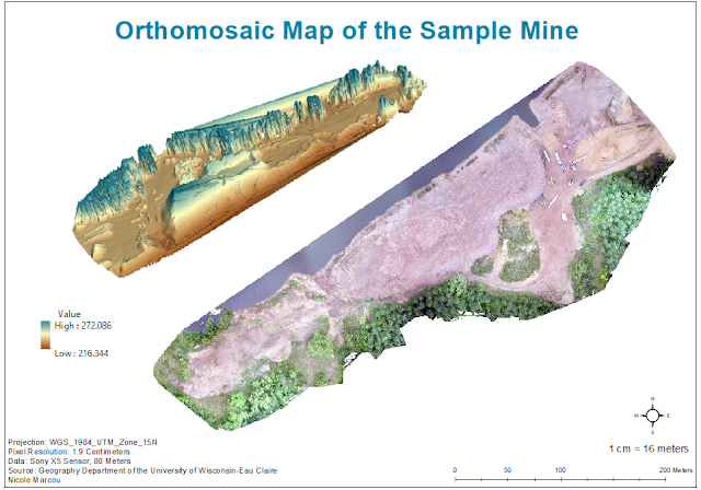
The last task completed was making two different maps in ArcMap using the data from Pix4D. One map shows an orthomosaic image (Figure 5) of the sample mine landscape and the second map shows the digital surface model (DSM) (Figure 6) of the mine. Both maps also include an image of the mine from ArcScene that shows the elevated surface at a tilt for another reference. The hillshade feature in was also used to try and represent some of the topography of the mine landscape. Each map shows the mine in different ways which can be useful to the viewer when trying to analyze the landscape. The orthomosaic image shows the natural landscape and the DSM shows the elevation where red areas are higher in elevation that areas of green. The side image from ArcScene also helps to show the elevation where bluer areas are higher in elevation and browner areas are lower. However, this can be slightly misleading because the height of the trees were included in the elevation heights. 

Figure 5: Orthomosaic Map of the Sample Mine 

Figure 6: Digital Surface Model of the Sample Mine
Conclusion

Pix4D is a user friendly software that provides multiple features in analyzing data. Although this lab was merely scratching the surface at what this software can offer, the tasks completed in this lab were very interesting and easy to accomplish. Pix4D is unique in the fact that it can create video animations of sample areas which can help individuals when analyzing data. Overall, this lab offered  great practice in using Pix4D. It was nice to be able to used different features of Pix4D, ArcMap, and ArcScene together to create one map. This lab provided a strong basis of knowledge of the software to use in future labs.


Sources
https://pix4d.com/

Monday, February 19, 2018

Lab 3: Field Navigation Map

Introduction

Navigational maps are very important tools for surveying the land. The objective of this lab was to create two separate maps of the Eau Claire Priory that will be used in a future lab. When mapping real world landscapes, it is important to use the correct coordinate system and map projection. A geographic coordinate system defines locations on the earth by using a three-dimensional spherical surface. Latitude and longitude values give a specific position to data points referenced on a map. A map projection is taking a three-dimensional spherical surface, like earth, and displaying it on a flat surface. There are many different types of coordinate systems and map projections, but certain types fit better with the specific data being used. For this lab, the WGS_1984_UTM_Zone_15N coordinate system and the Transverse Mercator projection were used.

Methods

To start, the WGS_1984_UTM_Zone_15N coordinate system needed to be projected onto the map. The Universal Transverse Mercator (UTM) coordinate system divides the world into 60 north and south zones that are 6 degrees longitude sections wide and are defined in meters. The Eau Claire Priory is located within the UTM zone 15 which is why this coordinate system was used (Figure 1). The study area that fits best within a certain UTM zone should be the one that is used to maximize the best results and avoid distortion.

Figure 1: United States UTM Zones
After the designated coordinate system was applied, the map could be created. A priory geodatabase was provided for the assignment that included all of the necessary information needed for this lab including lidar data, an Eau Claire basemap, elevation contour lines, and a navigational boundary of the Priory. First. the piorylidar raster and the priory_5ft line feature class were added into ArcMap to gain an idea of the terrain of the Priory (Figure 2). There was actually three different rasters of the lidar that was mosaicked into one for better imagery. 

Figure 2: Priory Lidar and 5 Ft Elevation Contours

Next, the Eau Claire basemap and the priorylidar raster was removed was added into the window to give the map some locational perspective. Before adding the navigational boundary, the project tool was used. This tool projects data from one coordinate system to another. This is necessary so that all of the data being used lines up spatially with each other on the same coordinate system. It is very important to chose the project tool and not the project define tool when trying to put all the data on the same coordinate system. Project define just changes the name of the coordinate system in the Data Frame Properties without actually just changing the coordinate system. This would be similar to calling a person "Brianne" when their actual name is "Alyssa". Alyssa would still be the same person but would just be called a different name. 

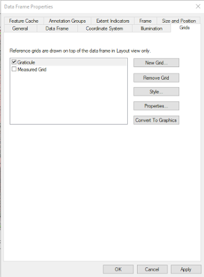
After creating the main imagery of the map, two grid were created in the Data Frame Properties (Figure 3). A Graticule and Measured Grid can be created using this feature. The Measured Grid had grid lines set to every 50 meters in Properties. The amount of decimal places and style of the numbers on the grid can also be changed in Properties to look more aesthetically pleasing on the map.

Figure 3: Grid Properties in Data Frame Properties

Lastly, the maps were resized to 11x17 in the landscape format in print and page properties. Then, the  final map elements were added: title, north arrow, scale, representative fraction bar, data sources, contour, description of coordinate system and projection, and water mark. The maps were then exported as PDF files.

Results/Discussion

Two separate navigational maps of the Eau Claire Priory with different grid systems were created during this lab. One map shows the Measured Grid that contains a UTM grid at 50 meters spacing (Figure 4) and the other shows a Graticule that provides geographical coordinates in decimal degrees (Figure 5).

Figure 4: Measured UTM Grid of the Eau Claire Priory
Figure 5: Geographical Coordinates in Decimal Degrees of the Eau Claire Priory
Summary/Conclusion

The maps created in this lab will very helpful when analyzing the Priory in a future lab. The importance of geographic coordinate systems and projections are showcased in this lab as well. Evaluating physical maps can be important for looking at spatial locations as well as digital maps.

Sources
https://support.esri.com
http://www.xmswiki.com/wiki/UTM_Coordinate_System


Monday, February 12, 2018

Lab 2: Sandbox Visualizing

Introduction

In Lab 1, critical thinking skills were used to create a terrain that included specific landscape features (Ridge, Hill, Depression, Valley, and Plain) in a 114cm by 114cm sandbox plot.  Using systemic point sampling, the terrain was surveyed and measurements were recorded at an even distribution throughout the plot.  Thumbtacks were placed evenly every 6cm around the border of the plot and then string was laced through to create a (X,Y) grid. Measurements were recorded at every string intersection with a table labeled X,Y, and Z. The Z column being the elevation measurements. Sea level was set at the top of the sandbox. More information regarding this lab can be acessed Here.


For Lab 2, Data Normalization was a very important concept because it refers to organizing and normalizing data. This means that the data is organized in such a way that multiple individuals can look at the same data set and receive the same interpretation from it. Making refinements to tables and analyzing the correct columns that would fit with a data set is important with Data Normalization. 

The systemic point sampling method was used to complete this activity in Lab 1. Now, the Interpolation tool in ArcMap will help to visualize the collected data and the quality of the survey. The Interpolation tool provides multiple techniques that "predict values for cells in a raster from a limited number of sample data points. It can be used to predict unknown values for any geographic point data, such as elevation, rainfall, chemical concentrations, noise levels, and so on" (ArcGIS Pro). 
Methods:

The first step was to create a geodatabase for the correct folder for this Lab. Then, the necessary steps were completed to normalize the data in Excel by setting the correct decimal values and making sure the data was set as numeric. The Excel file was then imported into the geodatabase.

To project the data in ArcMac, it needed to be added by using the 'XY data' option and then converted to a point feature class. With this type of data, it is not required to have a projected coordinate system because there isn't a specific landscape associated with the data points. Instead, a cadastral coordinate system was used to show the locations of the data points in relation to each other but without needing a coordinate system. This data shouldn't be projected because the data points were only being analyzed in relation to each other, but not being compared to a real landscape.

After that, the Interpolation tool allowed the points to be represented as a continuous surface. There are five different Interpolation techniques that will be demonstrated in this lab:

  • Spline: This tool uses a minimum curvature technique that results in a smooth continuous raster surface that will still end up passing through the data points. This technique leaves the data looking more realistic and works well when working with elevation, water table heights, or pollution concentrations. 
  • Inverse Distance Weighted (IDW): This tool focuses on the assumption that data that is closer in proximity to each other is more related than data that is farther in proximity to each other when creating a raster surface. This technique looks at the surrounding data of a specific data point to predict the measurement of that specific data point. IDW relies on the inference that data points that are closer to each other have some sort of relationship and would best be used in a situation where there aren't any outliers in the data set because IDW does not provide prediction standard errors. 
  • Natural Neighbors: This tool looks at the surrounding subsets of a data point to determine the interpolated heights. This technique will not represent ridges, peaks, pits or valleys that wouldn't already be represented by the the data points. This leaves the surface of the raster image to be overall be very smooth. Natural Neighbors would best be used where there is variance in different data points so there aren't as many duplicates.  
  • Kriging: This tool looks at the spatial correlation between data points to explain variance in the raster surface. This technique also fits a mathematical function to a specified number of points, which will determine the outlook value for each data point. Kriging would be best used in a situation where there is a known spatially correlated distance in the data. 
  • Triangulated Irregular Network (TIN): This tool is slightly different from the others in the fact that it is a vector-based surface. The image is more pointed and edgy because it is constructed by triangulating a set of points. The surface is basically made up of different sized triangles that represent nodes, faces, and edges. TIN would be best used when analyzing hgih-precision modeling of smaller areas. 
Then, the Interpolation data was opened in ArcScene which shows the terrain in 3D to offer another figure of reference. The 3D Scene image was exported as a 2D Portable Network Graphic (PNG). Scale was digitally drawn into the map to represent the 114cm by 114cm sandbox because as discussed previously, the terrain was not being compared to a real landscape so ArcMap was not able to insert a standard scale.


Results/Discussion

For each Interpolation technique, there were numerous color schemes that could have been chosen but a simple greyscale is what showed elevation differences the best. However, the TIN Interpolation looked best with a color scale. Each figure shows the image of the terrain produced from ArcMap and another 3D image on the bottom that was produced by ArcScene with both accompanied by a legend to explain the elevation. The Spline Interpolation technique shows a clean rounded finish of the terrain (Figure 1). The images show a very accurate representation of how the terrain looked in the sandbox plot. The darker and lighter areas correctly show the elevation changes. This technique really displays the ridges and the crater located on the hill in the upper right hand corner well.
Figure 1: Spline Interpolation 
The IDW Interpolation technique doesn't show as clean of a finish as the Spline Interpolation (Figure 2). Elevation changes can still be observed in the images but the terrain looks more bumpy instead of a smooth continuous elevated surface. This technique makes each data point more visible instead of connecting each gradually. 

Figure 2: IDW Interpolation
The Natural Neighbors Interpolation technique produces an almost too smooth of a surface to where it is hard to determine the differences in elevation (Figure 3). The image doesn't display the landscape of the terrain as well as the previous two techniques. The 3D image shows the terrain better than the ArcMap image does. 

Figure 3: Natural Neighbors Interpolation
The Kriging Interpolation technique also displays the terrain fairly accurately (Figure 4). The elevation is continuous and gradual and it portrays the terrain and its features (hills, ridges, depressions) similarly to the real life landscape. This technique is most similar to the Spline Interpolation. 

Figure 4: Kriging Interpolation
The TIN Interpolation technique portrays the terrain probably the least correctly out of all the Interpolation techniques (Figure 5). Some elevation is detected but the surface is not smooth. Because TIN images are constructed by triangulating sets of points, it leaves the terrain looking very edgy and pointy where the data points were collected.


Figure 5: TIN Interpolation


Summary/Conclusion

Each of these Interpolation techniques displayed a different image of the terrain. However, the Spline Interpolation technique portrays the terrain most accurately out of all five techniques. The surface is smooth like it was in real life and the elevation differences are very noticeable and continuous throughout. The systemic point sampling approach was shown best through the Spline Interpolation. This survey relates to other surveys because data normalization is a very important concept to remember when collecting data. Because the sandbox plot was only 114cm by 114cm, a grid based detailed survey was completed within a reasonable time. When surveying larger plots of land, there most likely wouldn't be enough time to complete as detailed of a survey. The Interpolation tool displays elevation well but can also be used for temperature, precipitation and noise levels as well.

Sources
Database Normalization - http://searchsqlserver.techtarget.com/definition/normalization
Comparing Interpolation Methods - http://pro.arcgis.com/en/pro-app/tool-reference/3d-analyst/comparing-interpolation-methods.htm