Monday, February 26, 2018

Lab 4: Introduction to Pix4D

Introduction:

The objective of this lab is to become familiar with the software program Pix4D. This software is very easy to use and is currently the premier software relating to processing UAS data, which is mainly used for constructing point clouds. Pix4d uses drone imagery to create georeferenced maps and models. For this lab, Pix4D was used to calculate volumes, create animations, and create a map using the data from this software.

For Pix4D to process imagery, the overlap needs to be set at a 75% frontal overlap. To ensure the consistency of the imagery, the user should take the images in a uniform grid pattern of the study area. Also, there should be at least a 85% frontal overlap when the user is flying over sand, snow, or uniform fields. A unique feature of Pix4d is the Rapid Check which runs inside the software. This feature is an alternative initial processing system where accuracy is traded for speed. It has fairly low accuracy because it processes faster in an effort to quickly determine whether sufficient coverage was obtained.

Another unique feature of Pix4D is that it can process multiple flights at one time. However, it is important to make sure that the images have enough overlap. The heights of the images should be around the same to ensure that the images have the same spatial distribution. Other aspects to take in account for are having the images be taken during the same weather conditions and sun direction. Overlap of images is an important concept for processing multiple flights as well as oblique images.
Also, Pix4D uses GCP's to help with the adjusting of overlapping images, but they are not necessary with this software. Although, there are certain scenarios where using GCP's are actually recommended but they don't apply to this lab. When using this software, quality reports are displayed after each step of processing to inform the user whether a task has failed or succeeded.

Methods:

The first task completed using the software was calculating volumes of several piles on the mine landscape data provided by the professor of this course, Dr. Hupy. Using the volume tool, the boundary of the desired object (in this case it was sand piles) is traced by connecting points surrounding the object by left clicking the mouse and then closing the points by right clicking the mouse. Then, click the Compute button to receive the volume measurement of that specific pile. This process was done to three different piles on the landscape. The results from the volume measurements (Figure 1) are shown below as well as images of the piles (Figure 2).

Figure 1: Volume Measurements of Sand Piles 
Figure 2: Image of Sand Piles That Were Used For Calculating Volumes
The next task that was completed using Pix4D was creating a video animation of the sample mine area as well as the volume piles. By clicking on the raycloud tab and then the video button, the user can move the mouse in whichever desired direction and record the waypoints. This gives freedom to the user to zoom in, rotate, and even tilt the image to create an inclusive representation of the area. Once all of the waypoints are recorded, the video can be rendered and exported. The results from the video animations are included below. The first video (Figure 3) shows two of the volume piles and the second video (Figure 4) shows the other pile. Each video shows a different route providing different angles.


Figure 3: Video Animation of 2 of 3 Volume Piles

Figure 4: Video Animation of 1 of 3 Volume Piles

The last task completed was making two different maps in ArcMap using the data from Pix4D. One map shows an orthomosaic image (Figure 5) of the sample mine landscape and the second map shows the digital surface model (DSM) (Figure 6) of the mine. Both maps also include an image of the mine from ArcScene that shows the elevated surface at a tilt for another reference. The hillshade feature in was also used to try and represent some of the topography of the mine landscape. Each map shows the mine in different ways which can be useful to the viewer when trying to analyze the landscape. The orthomosaic image shows the natural landscape and the DSM shows the elevation where red areas are higher in elevation that areas of green. The side image from ArcScene also helps to show the elevation where bluer areas are higher in elevation and browner areas are lower. However, this can be slightly misleading because the height of the trees were included in the elevation heights. 

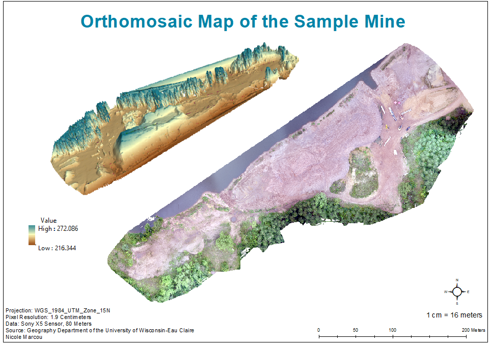
Figure 5: Orthomosaic Map of the Sample Mine 

Figure 6: Digital Surface Model of the Sample Mine
Conclusion

Pix4D is a user friendly software that provides multiple features in analyzing data. Although this lab was merely scratching the surface at what this software can offer, the tasks completed in this lab were very interesting and easy to accomplish. Pix4D is unique in the fact that it can create video animations of sample areas which can help individuals when analyzing data. Overall, this lab offered  great practice in using Pix4D. It was nice to be able to used different features of Pix4D, ArcMap, and ArcScene together to create one map. This lab provided a strong basis of knowledge of the software to use in future labs.


Sources
https://pix4d.com/

Monday, February 19, 2018

Lab 3: Field Navigation Map

Introduction

Navigational maps are very important tools for surveying the land. The objective of this lab was to create two separate maps of the Eau Claire Priory that will be used in a future lab. When mapping real world landscapes, it is important to use the correct coordinate system and map projection. A geographic coordinate system defines locations on the earth by using a three-dimensional spherical surface. Latitude and longitude values give a specific position to data points referenced on a map. A map projection is taking a three-dimensional spherical surface, like earth, and displaying it on a flat surface. There are many different types of coordinate systems and map projections, but certain types fit better with the specific data being used. For this lab, the WGS_1984_UTM_Zone_15N coordinate system and the Transverse Mercator projection were used.

Methods

To start, the WGS_1984_UTM_Zone_15N coordinate system needed to be projected onto the map. The Universal Transverse Mercator (UTM) coordinate system divides the world into 60 north and south zones that are 6 degrees longitude sections wide and are defined in meters. The Eau Claire Priory is located within the UTM zone 15 which is why this coordinate system was used (Figure 1). The study area that fits best within a certain UTM zone should be the one that is used to maximize the best results and avoid distortion.

Figure 1: United States UTM Zones
After the designated coordinate system was applied, the map could be created. A priory geodatabase was provided for the assignment that included all of the necessary information needed for this lab including lidar data, an Eau Claire basemap, elevation contour lines, and a navigational boundary of the Priory. First. the piorylidar raster and the priory_5ft line feature class were added into ArcMap to gain an idea of the terrain of the Priory (Figure 2). There was actually three different rasters of the lidar that was mosaicked into one for better imagery. 

Figure 2: Priory Lidar and 5 Ft Elevation Contours

Next, the Eau Claire basemap and the priorylidar raster was removed was added into the window to give the map some locational perspective. Before adding the navigational boundary, the project tool was used. This tool projects data from one coordinate system to another. This is necessary so that all of the data being used lines up spatially with each other on the same coordinate system. It is very important to chose the project tool and not the project define tool when trying to put all the data on the same coordinate system. Project define just changes the name of the coordinate system in the Data Frame Properties without actually just changing the coordinate system. This would be similar to calling a person "Brianne" when their actual name is "Alyssa". Alyssa would still be the same person but would just be called a different name. 

After creating the main imagery of the map, two grid were created in the Data Frame Properties (Figure 3). A Graticule and Measured Grid can be created using this feature. The Measured Grid had grid lines set to every 50 meters in Properties. The amount of decimal places and style of the numbers on the grid can also be changed in Properties to look more aesthetically pleasing on the map.

Figure 3: Grid Properties in Data Frame Properties

Lastly, the maps were resized to 11x17 in the landscape format in print and page properties. Then, the  final map elements were added: title, north arrow, scale, representative fraction bar, data sources, contour, description of coordinate system and projection, and water mark. The maps were then exported as PDF files.

Results/Discussion

Two separate navigational maps of the Eau Claire Priory with different grid systems were created during this lab. One map shows the Measured Grid that contains a UTM grid at 50 meters spacing (Figure 4) and the other shows a Graticule that provides geographical coordinates in decimal degrees (Figure 5).

Figure 4: Measured UTM Grid of the Eau Claire Priory
Figure 5: Geographical Coordinates in Decimal Degrees of the Eau Claire Priory
Summary/Conclusion

The maps created in this lab will very helpful when analyzing the Priory in a future lab. The importance of geographic coordinate systems and projections are showcased in this lab as well. Evaluating physical maps can be important for looking at spatial locations as well as digital maps.

Sources
https://support.esri.com
http://www.xmswiki.com/wiki/UTM_Coordinate_System


Monday, February 12, 2018

Lab 2: Sandbox Visualizing

Introduction

In Lab 1, critical thinking skills were used to create a terrain that included specific landscape features (Ridge, Hill, Depression, Valley, and Plain) in a 114cm by 114cm sandbox plot.  Using systemic point sampling, the terrain was surveyed and measurements were recorded at an even distribution throughout the plot.  Thumbtacks were placed evenly every 6cm around the border of the plot and then string was laced through to create a (X,Y) grid. Measurements were recorded at every string intersection with a table labeled X,Y, and Z. The Z column being the elevation measurements. Sea level was set at the top of the sandbox. More information regarding this lab can be acessed Here.


For Lab 2, Data Normalization was a very important concept because it refers to organizing and normalizing data. This means that the data is organized in such a way that multiple individuals can look at the same data set and receive the same interpretation from it. Making refinements to tables and analyzing the correct columns that would fit with a data set is important with Data Normalization. 

The systemic point sampling method was used to complete this activity in Lab 1. Now, the Interpolation tool in ArcMap will help to visualize the collected data and the quality of the survey. The Interpolation tool provides multiple techniques that "predict values for cells in a raster from a limited number of sample data points. It can be used to predict unknown values for any geographic point data, such as elevation, rainfall, chemical concentrations, noise levels, and so on" (ArcGIS Pro). 

Methods:

The first step was to create a geodatabase for the correct folder for this Lab. Then, the necessary steps were completed to normalize the data in Excel by setting the correct decimal values and making sure the data was set as numeric. The Excel file was then imported into the geodatabase.

To project the data in ArcMac, it needed to be added by using the 'XY data' option and then converted to a point feature class. With this type of data, it is not required to have a projected coordinate system because there isn't a specific landscape associated with the data points. Instead, a cadastral coordinate system was used to show the locations of the data points in relation to each other but without needing a coordinate system. This data shouldn't be projected because the data points were only being analyzed in relation to each other, but not being compared to a real landscape.

After that, the Interpolation tool allowed the points to be represented as a continuous surface. There are five different Interpolation techniques that will be demonstrated in this lab:

  • Spline: This tool uses a minimum curvature technique that results in a smooth continuous raster surface that will still end up passing through the data points. This technique leaves the data looking more realistic and works well when working with elevation, water table heights, or pollution concentrations. 
  • Inverse Distance Weighted (IDW): This tool focuses on the assumption that data that is closer in proximity to each other is more related than data that is farther in proximity to each other when creating a raster surface. This technique looks at the surrounding data of a specific data point to predict the measurement of that specific data point. IDW relies on the inference that data points that are closer to each other have some sort of relationship and would best be used in a situation where there aren't any outliers in the data set because IDW does not provide prediction standard errors. 
  • Natural Neighbors: This tool looks at the surrounding subsets of a data point to determine the interpolated heights. This technique will not represent ridges, peaks, pits or valleys that wouldn't already be represented by the the data points. This leaves the surface of the raster image to be overall be very smooth. Natural Neighbors would best be used where there is variance in different data points so there aren't as many duplicates.  
  • Kriging: This tool looks at the spatial correlation between data points to explain variance in the raster surface. This technique also fits a mathematical function to a specified number of points, which will determine the outlook value for each data point. Kriging would be best used in a situation where there is a known spatially correlated distance in the data. 
  • Triangulated Irregular Network (TIN): This tool is slightly different from the others in the fact that it is a vector-based surface. The image is more pointed and edgy because it is constructed by triangulating a set of points. The surface is basically made up of different sized triangles that represent nodes, faces, and edges. TIN would be best used when analyzing hgih-precision modeling of smaller areas. 
Then, the Interpolation data was opened in ArcScene which shows the terrain in 3D to offer another figure of reference. The 3D Scene image was exported as a 2D Portable Network Graphic (PNG). Scale was digitally drawn into the map to represent the 114cm by 114cm sandbox because as discussed previously, the terrain was not being compared to a real landscape so ArcMap was not able to insert a standard scale.


Results/Discussion

For each Interpolation technique, there were numerous color schemes that could have been chosen but a simple greyscale is what showed elevation differences the best. However, the TIN Interpolation looked best with a color scale. Each figure shows the image of the terrain produced from ArcMap and another 3D image on the bottom that was produced by ArcScene with both accompanied by a legend to explain the elevation. The Spline Interpolation technique shows a clean rounded finish of the terrain (Figure 1). The images show a very accurate representation of how the terrain looked in the sandbox plot. The darker and lighter areas correctly show the elevation changes. This technique really displays the ridges and the crater located on the hill in the upper right hand corner well.
Figure 1: Spline Interpolation 
The IDW Interpolation technique doesn't show as clean of a finish as the Spline Interpolation (Figure 2). Elevation changes can still be observed in the images but the terrain looks more bumpy instead of a smooth continuous elevated surface. This technique makes each data point more visible instead of connecting each gradually. 

Figure 2: IDW Interpolation
The Natural Neighbors Interpolation technique produces an almost too smooth of a surface to where it is hard to determine the differences in elevation (Figure 3). The image doesn't display the landscape of the terrain as well as the previous two techniques. The 3D image shows the terrain better than the ArcMap image does. 

Figure 3: Natural Neighbors Interpolation
The Kriging Interpolation technique also displays the terrain fairly accurately (Figure 4). The elevation is continuous and gradual and it portrays the terrain and its features (hills, ridges, depressions) similarly to the real life landscape. This technique is most similar to the Spline Interpolation. 

Figure 4: Kriging Interpolation
The TIN Interpolation technique portrays the terrain probably the least correctly out of all the Interpolation techniques (Figure 5). Some elevation is detected but the surface is not smooth. Because TIN images are constructed by triangulating sets of points, it leaves the terrain looking very edgy and pointy where the data points were collected.


Figure 5: TIN Interpolation


Summary/Conclusion

Each of these Interpolation techniques displayed a different image of the terrain. However, the Spline Interpolation technique portrays the terrain most accurately out of all five techniques. The surface is smooth like it was in real life and the elevation differences are very noticeable and continuous throughout. The systemic point sampling approach was shown best through the Spline Interpolation. This survey relates to other surveys because data normalization is a very important concept to remember when collecting data. Because the sandbox plot was only 114cm by 114cm, a grid based detailed survey was completed within a reasonable time. When surveying larger plots of land, there most likely wouldn't be enough time to complete as detailed of a survey. The Interpolation tool displays elevation well but can also be used for temperature, precipitation and noise levels as well.

Sources
Database Normalization - http://searchsqlserver.techtarget.com/definition/normalization
Comparing Interpolation Methods - http://pro.arcgis.com/en/pro-app/tool-reference/3d-analyst/comparing-interpolation-methods.htm

Monday, February 5, 2018

Lab 1: Create a Digital Elevation Surface

Introduction:

Sampling is a more time efficient way to collect data for a whole population. By analyzing data from the sample of a whole population, one can use that information to make predictions about the total whole population. Within sampling, there are three main strategies that are used:

  • Random: samples are completely bias because each have an equal chance of being selected
  • Systematic: samples are selected on an interval basis with regular distribution in spatial context
  • Stratified:  samples are selected from subgroups of the total whole population to ensure the samples are more representative of the total population 
The objective of this lab is to use critical thinking skills to create a terrain that includes specific landscape features (Ridge, Hill, Depression, Valley, and Plain) and then survey and map the designed surface by thinking spatially (Figure 1). A 114cm by 114cm sandbox was provided to create the terrain. 

Figure 1: Creating the Terrain
Methods:

For this lab, the systematic point sampling technique was used because it allows samples to be selected systematically using a grid system which ensures that each sample will be evenly distributed throughout the total area of the sandbox. This technique was chosen because it provides evenly distributed points throughout the total area of the sand box that would better represent the created terrain. 

The location of the sample plot (sandbox) is located on the University of Wisconsin-Eau Claire campus. The plot is on the east side of Phillips Science Hall, on the opposite side of Roosevelt Avenue, and close in proximity to a shed. 

The required materials include: sandbox, sand, thumbtacks, string, meter stick, pencil, and a field notebook.

To set up the plot for systematic point sampling, a meter stick was used to measure every 6cm around the border of the sandbox and marked by a pencil mark. Next, the thumbtacks were placed at the 6cm marks which allowed there to be a grid system of 20 by 20 boxes (Figure 2).

Figure 2: Placing Thumbtacks Around the Perimeter of the Plot
Then, string was laced around each thumbtack to officially create the (X,Y) grid system. The bottom left hand corner of the sand box was (0,0) and continued on from there (Figure 3). Each intersection where the X string crossed the Y string was measured with the meter stick and the measurement was recorded in a field notebook with a table containing X, Y, Z. Sea level is represented by the top of the sandbox.

Figure 3: String Laced Around Each Thumbtack
This system worked well with terrain measurements (Z) so that they could stay organized and be identified with specific (X,Y) points on the grid. The measurements were then transferred from a field notebook to a Microsoft Excel document to be further analyzed. 

Results/Discussion

After transferring all of the data into Excel, the sample values could be evaluated in (X,Y) grid formation (Figure 4). The left bottom box represented in blue color displays the first (0,0) sample and the other yellow boxes show the rest of the sample points with (X,Y) coordinates on the side to show location in the plot. Each sample is a negative number because sea level was represented by the top of the sandbox on the plot. So, each sample is that distance in cm from sea level which is zero.

Figure 4: The 400 Sample Points in Grid Formation
Total Sample Points: 400
Minimum Value: -19
Maximum Value: -4.2
Standard Deviation: 2.7
Mean: -13.66
Median: -11

The sampling that was chosen related well to this method of recording the measurements because the total number of sample points was 400 which was enough elevation measurement points to accurately represent the created terrain. Although recording the samples at each (X,Y) location where the strings intersected seemed a little tedious, the sampling technique stayed the same to ensure accuracy with the samples. Taking evenly distributed samples to start the surveying process and then taking less samples during the end wouldn't have provided as precise of data. When this lab was performed, it was February 1st, so it was very cold and there was ice surrounding the wooden border of the plot which needed to be chipped away to be able to place the thumbtacks in. During the entire process of this lab, snow continued to be nudged into the sandbox and needed to be removed. Also, because of the cold temperature, the ground was frozen where the terrain was created but luckily there was enough free sand to construct the landscape.

Conclusion
The sampling conducted in this lab relates to the definition of sampling that was provided in the beginning of this post because specific points of the plot were chosen to be sampled to create an accurate representation of the terrain without completely taken measurements of every aspect of the terrain. From the 400 sample points recorded, predictions can be made about the shape of the terrain. Sampling is effective in a spatial situation because it would take an immense amount of time to record samples of every location in a given space. Sampling saves a lot of time while still providing enough needed information about a space. This lab is a good example of how samples would be collected over a larger spatial area because there is a lot more ground to cover. The samples that were collected during the survey of the plot were an adequate representation of the terrain. However, more samples could have been taken in areas of the plot where the terrain had greater variance in elevation like the ridges or depressions. 

Sources:
http://www.rgs.org/OurWork/Schools/Fieldwork+and+local+learning/Fieldwork+techniques/Sampling+techniques.htm